
Menu..::LvLForumExploreSearchProfile avatar

The Abandoned Post
Electro & Killazontherun

Added: 7 Dec 2002
Write a comment
Bold
Italics
Small
More...
Preview only
sedawkgrep
26 May 2026 #24
Great looking map! I agree with @raspatan - it's VERY confusing to navigate.

I think the item spread and navigation (aside from being confusing) is great. One small complaint is I would swap the MH and RA and remove the YA which is nearby the MH. As it is you have to rocket jump to reach the RA and it's in a dangerously unsafe location. In contrast, the MH is in a corridor near the bottom that's easy to miss and hard to defend.

Overall though I really like this map. It works well 1v1 and probably great for a group.

I like the South Park easter egg.
Edited 33 seconds after the original posting.

1
Reaction ~ Reply ~ Report
raspatan
16 May 2021 #23
It's a nice looking map for a 3 FFA. But it is very very confusing. Too many corridors and layers. I played it at least 5 times and couldn't quite figure out how to get to all places.
1
Reaction ~ Reply ~ Report
FragTastic
4 Feb 2012 #22
Terrific XD!
Reaction ~ Reply ~ Report
AEon
25 Aug 2009 #21
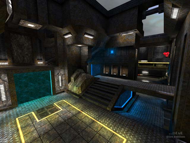
Very detailed texturing with clever design elements, and lighting. In a few areas one could argue, that it is a tad on the dark side, but you could also say that adds to the atmosphere. Interesting layout and gameflow, that the bots play fairly well.

Again, I am not certain the 5 (or were there more?) TPs really had to be added to the map. IMO, one TP would have been fine, dropping all the others. There are enough paths via stairs etc. the player can take. Presently I had the feeling quite a few of these valid paths were under-used, because the player and the bots are simply too lazy to take them, preferring the TPs. Too many TPs make the gameplay fast but also erratic, something that can get on the players nerves after a while. It also adds an element of chaos: When trying to fight one bot suddenly another teleports into the area, disrupting "your sure win". Or you have an opponent nailed, but he/she simply escapes via TP.

Make no mistake, this map is definitely worth a download.
Edited: 25 Aug 2009 AEST
2
Reaction ~ Reply ~ Report
Mark
16 Jul 2008 #20
WooHoo! This is a killer map in every respect except 1. I would have liked to be able to jump from MH to GL without using RL. It can probably be done it just seems a little difficult to achieve given the height of the archway. Wonderful use of teleporters - a very refined understanding of cpma physic at play here. The RL/RA/Green health balls area is sumptuous - yes, sumptuous! Favourite jumps. Circle to walkway to red armour and uturn from sg teleporter to GA. Is 11 out of 10 a valid score?
Edit ~ Delete
ras
6 Mar 2004 #19
mad map!!! very good :)
Edit ~ Delete
EBUK
14 Dec 2002 #18
Shame that, maybe one day someone will pick up the gauntlet..
Edit ~ Delete
sock
13 Dec 2002 #17
Congrats on the review of your map. Its about time this one saw the light of day.

Good job Electro/Killaz

Sock

Edit ~ Delete
Electro
13 Dec 2002 #16
EBUK: i dont remake maps, i prefer to make new ones.

hannibal: thanks ;)

Edit ~ Delete
hannibal
10 Dec 2002 #15
Top shelf, gentlemen.
Edit ~ Delete
EBUK
10 Dec 2002 #14
I always dreamed that one day someone would release a Quake 3 ver of Vondurs Zed (Q1 - 24/05/99).. maybe someone has?

Still if you guys have any spare time on your hands, maybe!? lol would be great with CPMA!.

Edit ~ Delete
The Hubster
10 Dec 2002 #13
Fantastic piece of work - Benny had you not got Killa to help you, you would never have finished this map you slacko!

Well done guys!

1
Edit ~ Delete
SD][JuggerNaut
9 Dec 2002 #12
man, talk about atmosphere! Killazontherun's Tombs Of Necrobiosis and StormShadow's Gloom TO THIS DAY remain two of my all-time favorite maps because of that aspect alone.

the map is a little dark, but not too much so. certainly adds to the abandoned feel. gameplay is great. usually i don't go for the low overhead passages type layout, but this one is truly different. my buddy and i found ourselves REALLY paying attention to sound in this map. great layout of weaps/armor/health/powerups to.

hope to see more of this kinda mapping from you guys. two thumbs up and a 9 from me. excellent work.

Edit ~ Delete
bXr
8 Dec 2002 #11
Man, it's dark in the map... But the level design is sweet! I had to raise to brightness level to max to see anything...
Edit ~ Delete
Electro
8 Dec 2002 #10
oh great, i made a typo on the levelshot... i'm sort of a perfectionist (in my mind anyway) so this is going to drive me insane unlesss i fix it :P

i can fix it so that anyone who downloads it from this point has it corrected, and compatibility between the 2 different ones wont be a problem.

thanks for the comments! i have a teamplay map around 60% done ;)

Edit ~ Delete
StormShadow
8 Dec 2002 #9
well, maybe my monitor is just dark, cuz i really had trouble seeing anything in r_gamma 1
Edit ~ Delete
EBUK
7 Dec 2002 #8
For me this is one of those maps that comes along and just has it all going on, maybe the more fluent with the editor can pull it to bits, but if a map succeeds at stimulating the eye as well as the mind with its great game play/atmosphere, then this is a classic!

If the new CPMA map pack does materialse it would be a shame to not see this one in there.

9/10 'cos nothing is perfect :)

Edit ~ Delete
nitin
7 Dec 2002 #7
I disagree with stormshadow, this map is a perfect example of atmospheric lighting. The map actually feels like an abandoned post due to the lighting and yet I have never once had trouble seeing my enemies on it, despite the dark spots. Extremely well done aesthetic by klzotr.

Gameplay is probably better than the look which is saying something, electro has produced a stunning layout which is nice and tight yet still affords plenty of open space.

Grat job, a 9.

Edit ~ Delete
Killazontherun
7 Dec 2002 #6
Hmm, didn't notice the loading screen text, Electro did it so blame him hehe :P

Thanks for the comments peeps :)

Edit ~ Delete
Killazontherun
7 Dec 2002 #5
Hmm, didn't notice the loading screen text, Electro did it so blame him hehe :P

Thanks for the comments peeps :)

Edit ~ Delete
pjw
7 Dec 2002 #4
Wow. LvL did odd things to that URL, but it still seems to work.

I'm also trying really hard to make that ramp jump to the RA in CPM, but haven't been able to yet. Don't have the skillz. :( I'll work on it. :)

Edit ~ Delete
pjw
7 Dec 2002 #3
This map is one of the best to be reviewed here in quite a while. It kicks so much ass that I've granted it the Kickass Map Award and added it to the short list on my site: www.planetquake.com/pjw/maps.html

A nine from me, only because nothing's perfect, and there's always something to be a nitpicky bastard about (in this case, I see a sparklie here and there, and the loading screen, oddly, says The Abandoned Base when the map is The Abandoned Post), but that's truly minor stuff. It's very rare that, as wvw pointed out, you get a map that's outstanding in both departments.

Howsabout another creation from you two? I'm greedy for maps of this quality. :)

Edit ~ Delete
wviperw
7 Dec 2002 #2
This is a GREAT map IMO. Its not often you hit the nail on the head with BOTH gameplay and looks. I think we need superhero duo's like Electro and Killazmore often. :)
Edit ~ Delete
StormShadow
7 Dec 2002 #1
Nice map, well designed.. lots of cool jumps in CPMA...

One prob: in default lighting, the map is very, very dim, and almost unplayable. I had to jack up gamma to see anything ;/ But luckilly, few people play with default lighting anymore :)

Edit ~ Delete
Theme:
Bots:
Textures:
Not set
Comments:
24 comments (123 days ago)
Ranked:
Downloads:
10,288 & 382 LiveViews (daily avg. 1.23)
File:
ek3dm1.zip, 6.91 MiB
PK3 date:
9 Nov 2002
..::LvL ID:
NewerOlder

Map history:
Clear
    ..::LvLExplore
    Search history
      ..::LvL Markdown
      The following syntax can be used to format comments.
      Close

      Loading...

      Map Search

      Search for a map.

      Results will appear here.

      Map peak