
I would suggest a rework baring in mind the following keypoints:
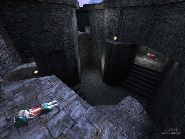
:: texturing/lighting - very important. As mentioned, this map at r_picmip 5 becomes a blur. Simple texturing, with contrasting will increase visibility. And no, im not talking about your q3W-style 30-staged shaders here, Im talking about SMART texturing.
:: items in general - playtesting is needed for this. And, dicussions. Lots of it.
Head over to the Challenge forums ( www.challenge-netw...n/ikonboard.cgi ), you'll find all the advice you need: post a thread, and it will get attacked with solid feedback in no time at all;-)
I think texturing the entire map in the same texture/color wasnt necesarilly a good idea however. A lot of the more competetive players play with vertex lighting and a high picmip setting, and under these graphics settings some of the architecture tends to blend in. There was a rock jutting out in one of the staircases that you can trick jump off of, but it was very difficult to see because it blended into the wall so much. There were other instances of this as well. Also, because of the 'sameness' of the architecture and texturing, its hard to tell where you are at a glance. For instance if you spawn somewhere (unless you know the map well) it can be hard to tell where you are immediately.
Neither of these are big problems, after learning the map a bit, they are no longer factors at all, but on your next map you might want to add a bit fon contrast to your textures, and stuff like that.
In terms of gameplay, i think the map is awsome, i had a lot of fun playing it, and im gonna keep it on my hd for sure. GJ!
I wanna know, what do U think about map.
Loading...
Search for a map.
Results will appear here.
