
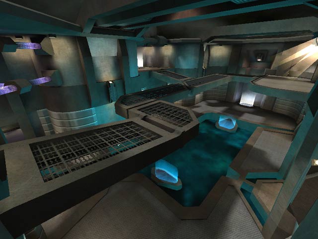

Unfortunately, where the author deviates from that end up being points of frustration. Things like the acid floor with the two opposing jumppads (which send you to the opposing side...ugh) just leave the player annoyed and wondering why they weren't scrapped during testing.
Anyhow this isn't a bad map at all. Simply rather forgettable.
Edited 31 seconds after the original posting.



Gameplay is great, looks superb..
4 years down the line and it still kicks ass!
The understated, yet detailed visuals and excellent use of architecture and shaders rate this map a solid 9.
The only trifle I have with it is the overly complex teleportal-thingy.
Beautiful work.
seem quite right to me.
1 point... based on the screenshot? I appreciate your support!
This is the best use of spotlights I've ever seen on a map. The lighting as well as the light fixture design is right on. I couldn't take my eyes off of the cool-mint lighting in the hallways!
Your mapping skills are obviously at a professional level. (I have no idea if yer working in the gaming industry....but you should be)
I just can't get over the graceful simplicity of the overall design and even implementing this philosophy in the smallest of details.
The bouncepads are cool, but IMHO I thought the length of the volumetric beam/brush was too long. Oh well.
Your teleporter route takes you to every part of the map, except for that quick switch from the RL. I would have prefered a few more jumppads in place of the teleporters to the second level, however. Or perhaps some stairs. Whatever, these are nit picks.
Shit, I just can't get over the quality of this map in terms of simplistic detail. The eye candy abounds, but it's certainly not too distracting.
Seriously, most mappers don't think of adding a simple touch such as pipes on a grated catwalk. It really shows you have a nack for artistic expressionism in maps.
Sure, gameplay is KING.
This map isn't even as fast as I like, but mapping is also an art. When you can make an "average" map stir Tig and Mandog to rate it as a "must have level", then you know there's more goin on than just eye candy.
Seriously, if Tig and Mandog call my map a "must have level" then I'll be pleased beyond all hell.
Laerth, you have my respect. Your shit is good.
If my next map doesn't look half as good as this, whoa boy!
The layout could have been a bit more vertical with another level but that's a personal nitpick. I also had to add another bot to intensify gameplay.
Holy fkin shit man! What a beautiful map.
I'm givin this thing ten. The playablity was a bit slow, but the effort put forth for the eye candy is why I bought a 32 MB video card in the first place.
Kudos.
When's the next one?
yes but gameplay is nothing innovative. As Johnny Law says everyone has different opinions about gameplay but for me the layout is "by the book" and results in predictable a game.
Rather than tsk-tsking about people who "STILL after all this time, judge a book by it's cover", maybe you should consider that perhaps some people simply have different opinions about what makes good gameplay.
It's a shame that many people STILL after all this time, judge a book by it's cover. It appears to me, that while much effort has been put into the texturing and brushwork of this level, little effort has been put into it's layout.
There are levels out there that look like they were drawn in crayon, but their gameplay features are unparalleled.
In short - A simple, pretty map for newbies.
But I can't help wondering if there hasn't been a price for this focus. In particular, the overall layout is just too simplistic: a few kinks in the corridors and a couple of sets of teleports can't disguise the fact that this is just three rooms linked in a circuit. Normally I start on a map mystified and confused by the layout, then after a while things become sort of clearer; true of this map also, except for the 'after a while' bit. I don't know whether it's because of this or for some other reason, but my experience tallies with those who say that this isn't a particularly hard-fighting map.
The individual rooms, of course, were much better conceived; and in particular, anyone who's ever envied those rocket jumps the pros do to get out of the lava in q3dm13 will find the slime pool in this map a good place to start practising that sort of thing.
As I say, a beautiful map; but there is one visual effect in it which irritates me - and for that matter, also irritated me in 'Nothing at All'. The lamp glare effect that 'supports' the weapons, used in both maps, doesn't seem to feather off properly, but cuts off abruptly to produce an unconvincing boxy effect to the glare. I don't know whether this is an inevitable effect of the engine, or whether the shader used needs some tweaking. Oh yes, and what did the poor railgun do to Laerth that he felt minded to deprive it of its limelight?
Overall, then, a slight disappointment. But even second-best from Laerth is better than most people's best; and while I can understand why a previous correspondent rated it as a 4, I (if I were minded to give numerical ratings) would certainly put it a deal higher than that.
...very nice
yet 3 bots just seemed a little slow for me.
item placement was well spread out and there wasn't too much health(a good thing).
lighting and textures were great, yet not distracting.
very well made.
not the frag fest I was looking for, I'll have to try 4 or 5 bots.
I'm not in to hunting, so 1vs1 is out.this map is just too big.
low end users will enjoy this map.
good work.
It's not a DFA divebombing map, but there's some good 2- and 3-level combat.
Looks good too, of course. :-) Great example of the kind of angular architecture you can hurl around when using homogenous textures.
It's available on the Mothership Duel server for voting, see the servers section here at LvL for details.
(BTW, is it just me or is LvL HELLISHLY slow today?)
Loading...
Search for a map.
Results will appear here.
