Added 23 Jan, 2004
Comments
Add a comment
**Preview only**
Be sure to submit your comment
Be sure to submit your comment
Submitting comment...
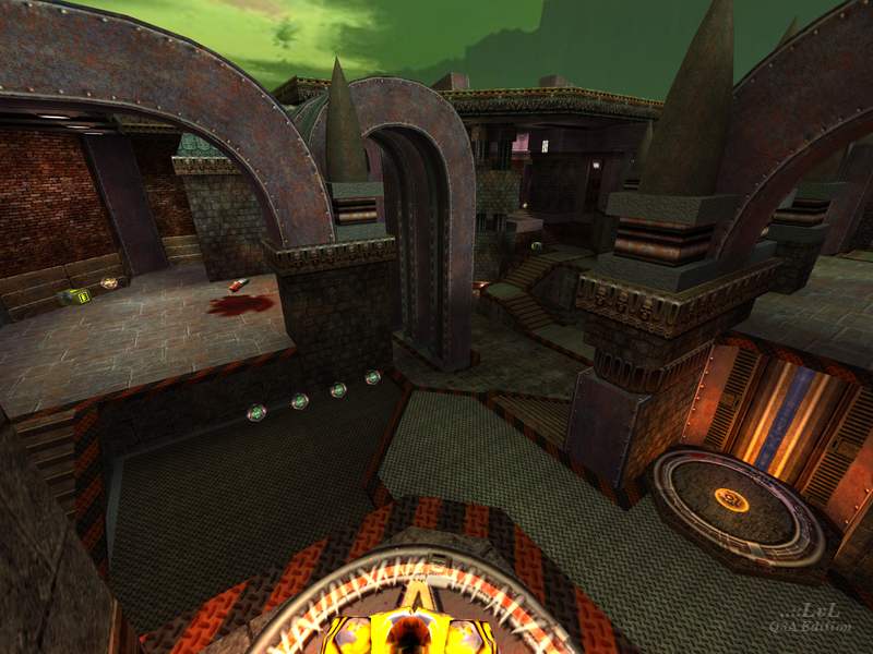
It's very complex. Almost as if the author has merged two arenas into one and this is the result. Of course this isn't the case - as evidenced by the levelshot sketch - the author has put some thought into this layout.
Visually, this map is interesting. Not sure how to describe it, but I don't mind it. A pretty solid map.
Agree (1) or Disagree (0)
This is potentially a good map. I think the texture theme is good but not fully realised, I'd drop the tech textures and move more towards the art deco thing. The banners are really horrid though.
The layout needs work, removing some of the little nooks and the player clipping is awful (awful as in remove most of it and if you must then just put very small slips to allow players to brush past projections).
Agree (1) or Disagree (0)
I didnt think it was ugly.. although i didnt like some of the effects.
Cool map.. tons of routes.. looks like it would be really fun with 3-4 people.
8/10
Agree (1) or Disagree (0)
The layout in this one, while great for complexity, is a little overdone, and a bit too open imho.
Still though, for ingenuity with the layout alone, it's worth a 7: the amount of options available to the player is really great.
While not something I usually comment on, I'll have to this time: this has to be one of the more ugly looking maps I've seen LOL
Overall, nice work though:-)
Agree (0) or Disagree (0)
I love tricky layouts with plenty of opportunities to go where your opponent least suspects, and this certainly fits the bill on that count. I actually thought the texture choices gel fairly well for the most part, and the brushwork has some great detailing which is often important to the movement in the map. Spotted a couple of tiny sparklies on some of the tall curve structures, but that's really not something that most people are going to care about. What a great map!
Agree (0) or Disagree (0)
