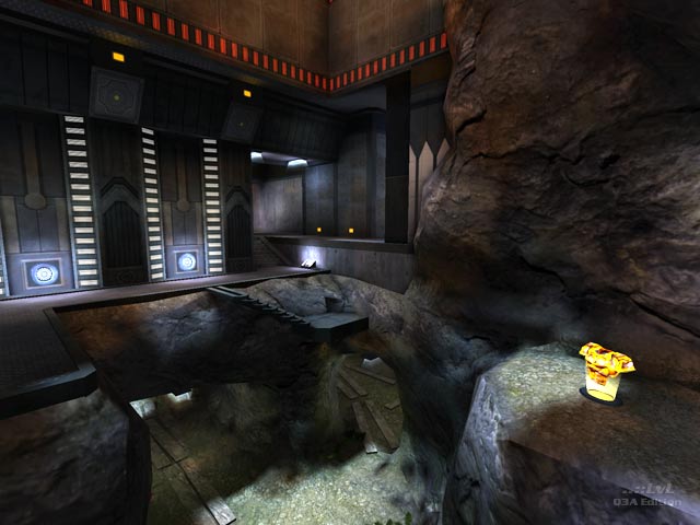
Gobl_tourney1 was a submission in the Summer 2010 NoGhost Mapping Competition where it received seventh place. While one may think seventh place is a bit unspectacular, one may think otherwise after seeing this map. This was the only collaboration map in the competition and it turned out rather interestingly.
First, I must note that this map was created in two and a half weeks. This is far less time than what was spent on most of the other entries, and thus, this map is a bit less polished. However, Bliccer and g0th were able to create an amazing map for just under three weeks. I really applaud them for their dedication to the map and their ability to develop it so quickly. I can not even dream of making a map this quickly. Truly, this was possibly the most surprising of the submissions due to that fact.
The first thing about the map I want to comment on is the architecture (and texturing) of the map. This map's theme is sci-fi on a seemingly new planet where the buildings are built into rock. The first thing that is noticeable when one loads the map is how nicely formed the rock formations are. Given the time frame in which this map was built, these two were able to pull off some impressive terrain building. The rock seems realistic, yet fits the theme perfectly. The shaping of the rock around the structure of the buildings, steps and platforms is exceptional. My only complaint is that the texturing is sometimes a bit off in portions of the rock due to the necessary moulding to make the rock look realistic. With more time, this might have been corrected, but it still looks great.
The sci-fi textures are really nice as well. I have not seen them in a map before, so I am assuming that they are customly made. A lot of them use a shader effect to make them shiny which contrasts well with the rough (rock) and dusty feel of the map. The textures themselves are also rather well made. It was refreshing to see some of the textures that they didn't make used in interesting ways as well, so I applaud that. The structuring using these textures is also very well planned, and the trimming is well done too. Overall, the texturing and architecture is very nice. While it is a little rough in some spots due to the time crunch, the textures were used well, and the terrain is very nice.
The next thing I want to comment on is the atmosphere. Essentially, players feel like they are on a red, dusty planet like Mars, except with a mild atmosphere (enough for plants to grow at the bottom). The sky, lighting, colors of the rock, and sci-fi textures really work together to produce an interesting aesthetic that is incredibly convincing despite being almost entirely unrealistic. The ambient lighting is nice, and the use of fencing is not bad either; I like that it refracts the view of textures while in motion. Some of the models seem out of place, though. The jump pads, while they do seem to fit in the theme of sci-fi, do not fit in with all of the other textures. The most interesting thing about the theme, though, is the giant tower that can be seen in the sky as if it is next to where you are (although unreachable). This really helps the theme along because it makes it seem as though the player is not in an isolated establishment on the planet alone. It was a great choice to place that there, so well done.
The layout could be better. Without much time for playtesting it is hard to know how the gameplay is developing. That being said, the gameplay is not bad. I almost wish it was a 2v2 map because I feel it accomodates more than just two players. The weapons are not necessarily badly placed, it just takes a while to accumulate a good stock of weapons. The MegaHealth and Red Armor are well placed, though, so that is good. The thing that bothers me the most is the placement of armor shards on the tiny "platforms" above the map. This may intice people to jump on them, but they are really annoying and hard to use efficiently. I feel they are essentially useless even if they do attempt to connect two different portions of the map. The thought is good, but with more playtesting Bliccer and g0th may have seen that these are not entirely utilizable by players. Other than that, the gameplay is acceptable.
The scale of the map is decent as well. There are portions that are really well scaled for interesting gameplay, but there are other parts of the map that are just so damn small compared to the rest of the map that it is constraining on the flow of gameplay and the overall feel of the map. While these parts negatively effect the layout of the map, they are hardly noticable since the map is so large. There is about 95% of the map that is acceptably scaled, so do not let this worry you too much. That being said, the map is quite large for a 1v1 match. I think it could work, but it may be a bit hit and miss. I would approximate the usual winning score of a ten minute match to be no higher than four points. The gameplay may be a bit slow paced at first, but it would probably pick up after players get to know the map. Regardless, I am sure this map can support some fun games.
Overall, this map is quite a good release. I enjoyed seeing the work of Bliccer and g0th and the only collaboration in the competition made in such a short time. It's really amazing that this quality of a map was able to be made in under three weeks. I am proud of these guys for essentially throwing their map together as neatly as they did. With more time this map could have possibly crawled up the ranks, but it's still a good map as it is.
I rate this map a 7.5/10. Given three more weeks, this map could have been something amazing. As it is now, though, it is a nice map. I recommend downloading it and playing it with your friends. If you should do this, try a 2v2 match on it and comment back here. I am curious to see which is better (1v1 or 2v2).
Good job, Bliccer and g0th. Impressive release!
Reviewed by Anthem
Ranked: 4.5 out of 5 (10 votes)
Download: Carved Grounds by Bliccer & g0th
