


(The demo is recorded under PR1.17, so it will be broken by later point releases, alas!)
Go to the demos page, and under Search select Quake3 as the game and bal3dm1 as the map. Leave All gametypes and All events selected. Download and enjoy!
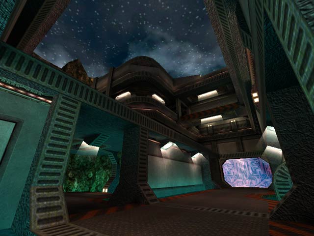
To start off, the level is very nicely done as far as architecture and detail is concerned. From there, though, it really loses its appeal. The flow doesn't work at all. The numerous teleporters do try to restore some of the missing flow, but i think that's a cheap workaround. Too many teleporters makes it impossible for a chase to take place in the level and make the learning curve for new players entering the level all that much steeper. The clipping problems could easily have been avoided by using the clip brush (so far as i can tell, this level doesn't use ANY clip brushes) on all of the rocks. Even with the rocks around the haste clipped off, the player can reach the haste by falling from the roof. And if you REALLY want the player to use the rocks, you should have added another wall or more rocks to make it so they couldn't see the bottom box of the sky. It just looks like crap, and it's the responsibility of the map designer to make it impossible for that crap look to show through. The questionable design decisions: 1) Advertisements. i've never liked them. Having a flashing Q3A sign is one thing. Advertising a website within a level is just kind of cheap and detracts from the atmosphere. How can you feel like your running around in some exotic locale when there's a blaring screen advertising where you can download other levels like it online? To me that's just cheesy. 2) The teleporters. This would be better if you had one or two teleporters. By themselves, there's really nothing wrong with the style used. But because of the sheer number of the teleporters, it would have been better if players could see where they were going beforehand. Also, to newbie players, the don't look anything at all like teleporters. More like strange-looking windows that look out to nothing. 3) The water (???). Why did you use a plain water texture for a liquid that hurts you? You should have used slime or lava, or at the very least the water-looking texture with electricity flashing across the surface. When you combine the fact that the liquid looks like harmless water with the spot in the map where there's a large pool of it at a dead end, you get alot of pissed off people who get hurt because they think that there's an underwater tunnel or something there, and then find out that not only is it a useless dead end, but it kills you! In my opinion, it just doesn't work.
Overall, i'd say the map is a nice attempt, but fails gameplaywise in various areas. A few more tweaks and the map would work a hell of alot better. i give it a 5.
If attention was paid to inhibiting the player's movements (just as important as connectivity/architecture/texturing), this would get an 8, but I've gotta mark it down for the skybox thing and being a bit too dark...
(5)
tHANKS!
-Benoit "Bal" Stordeur
bal.spawnpoint.org/
I'd have to say that the only thing I don't like about this map is the way you can look down at the sky below that dark block (what is that supposed to be?) beyond and below where the haste spawns. Regardless of this flaw- I still give it a 9.
I especially like in the main area how you can be being chased and then duck down a level into the teleport and it turns the fight completely around as you end up behind them.
Happy Fraggin! Octovus
(8 outa 10)
About the various issues...
First, for those of u who cant run the damn thing, try typing sv_pure 0 in the console before, i really dont understand why the map would need it, but ive seen it not work on some pcs cause of it (and work fine on other machines, strange...)
About the brightness, looks find on my pc =) sorry
About the clipping, i know seeing the bottom of the skybox is ugly, but ur supposed to be climbing on those rocks in the haste area, didnt want to have to build a secondary rock wall around it. Other then that i dont see where the rock clipping problems are... could u guys be more precise? =)
btw, thanks to tigger-on for the great review site!
-Benoit "Bal" Stordeur
bal.spawnpoint.org/
also this ain't a hardware help site :]
Scampie: working with Tigger has advantages.. I beat him with a wet sock until he looked at this map. Must've liked it and it skipped the queue.
This seems like it would be pretty easy to fix--c'mon, Bal, how 'bout a properly clipped version? Pretty please?
but a good map none the less. one of my faves
"U r0x0rz!" lol
/me waiting for triangular lights :)
Anyway, I didn't think it was too dark...just turn up the brightness, eh? (u do that for the Threewave maps too, no?). Anyway, this map has great atmosphere, great verticle playability, and the always nifty custom-looking tele's that I appreciate. I thought it was a solid effort and alot of fun vs. DOOM.
Perhaps a bit more use of curves and a quad powerup might have been fun, but that is just me. Adios!
dark.
Loading...
Search for a map.
Results will appear here.
