**Preview only**
Be sure to submit your comment
Scorpion Tank, I think you're talking about sst13, right? His maps are pretty much the same as you describe them.
Agree (0) or Disagree (0)
Scorpion Tank
unregistered
#25 21 May 2012
i remember some guy having 13 in his name which converted Q1 maps to Q3 very nicely. all his maps started with 13 (something like 13base) and they were very good. this guy should do more of his map, i don't remember a new release since 2011. i think his last map was iron hive.
Agree (0) or Disagree (0)
DooMsDaY
unregistered
#24 30 Jul 2000
It's a classic. Doesn't remind me of the original dm2, because of all this colored lighting. But the gameplay is as good as the original's. If not better.
Agree (0) or Disagree (0)
not entered
unregistered
#23 29 Mar 2000
Q1 & Q3 RULEZZZZZZZZZZZZZZZZZZ
i was dreamin' about Q1 lvls on Q3
Agree (0) or Disagree (0)
Mike Zuber
unregistered
#22 21 Mar 2000
I'll have to dust off my q1 CD and check it out, sounds fun. ;o)
q3q1dm3 is in the pipeline....it's just a matter of time.
Agree (0) or Disagree (0)
Dirt
unregistered
#21 21 Mar 2000
e1m2 is called Castle of the Damned, and is a class map, esp. for teamplay. It's also the map where Thresh played 'the ferrari game' afaik. </anorak>
Agree (0) or Disagree (0)
ST8
unregistered
#20 19 Mar 2000
class map, are you gona build a dm3 remake?????
Agree (0) or Disagree (0)
Andy
unregistered
#19 12 Mar 2000
I think this map rox
Agree (0) or Disagree (0)
Mike Zuber
unregistered
#18 04 Mar 2000
q1dm4 is already out on fileplanet and various other places. This website should be posting a review of it sometime in the near future (fingers crossed).
What is q1e1m2??? (The name of the map I mean.)
Agree (0) or Disagree (0)
HopE
unregistered
#17 02 Mar 2000
Please build q1dm4 and q1e1m2 too...phfsleeeeeeeeeeeeease. :)
Agree (0) or Disagree (0)
Fusion
unregistered
#16 01 Mar 2000
Hey Chummers, still concerned about that missing texture? I downloaded yesterday the Threewave maps and the texture appeared suddenly! Maybe it's like in Japanes Castles, there you needed again Threewave for all textures.
Agree (0) or Disagree (0)
Peronet
unregistered
#15 23 Feb 2000
Good as hell
Agree (0) or Disagree (0)
Dutch
unregistered
#14 22 Feb 2000
I like this map. As far as the bots being stupid about the floor w/ the lava , I have played against people that were easy to dunk also. I enjoyed killing them there as well.
The missing texture is what bothers me the most.Too bad , my eye is drawn to these points and I cant help it.Thanks Mike for the level
Agree (0) or Disagree (0)
CHiNX
unregistered
#13 21 Feb 2000
Theres an easy way to make that jump, just jump into the back wall, and rocket jump off it, gets ya round the corner easily.As for the map, great conversion, some very nice texturing, even tho it is a bit too dark on mycomp, but as author said, he has his gamma up high so u cant really critize for that.
Agree (0) or Disagree (0)
Tigger-oN
unregistered
#12 21 Feb 2000
oDD - I'm keen to see that jump, email it tigger@ebom.org, or maybe post a link to it?
Agree (0) or Disagree (0)
oDD
unregistered
#11 20 Feb 2000
Hey nice conversion. I playtested it and found can do the "round the corner" jump. Tho not too easily. If anyone wants a demo of this ill send them one. Also I found the level wasnt dark at all! You guys must have you gamma at like 0.7 :) A review will be up later on my site...
l8er
mapcc.q3center.com
Agree (0) or Disagree (0)
Mike Zuber
unregistered
#10 20 Feb 2000
q1dm2...dm2....duh....
Agree (0) or Disagree (0)
Mike Zuber
unregistered
#9 20 Feb 2000
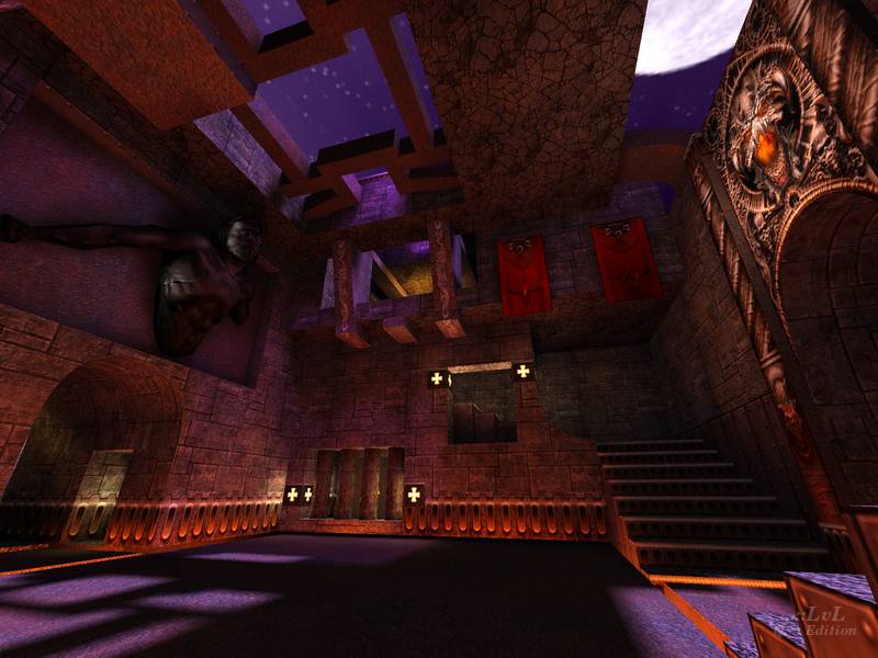
Aside from Ian Marks conversion (shiz_q1dm4 - using original textures & lighting) this is the best conversion of DM4 I've seen so far. Yes, there are gameplay issues that need to be dealt with because of Q3's physics, but
compared to other conversions I haven't seen a better one out there myself.
As far as the "missing texture" is concerned - it's something I've known about but there's nothing I can do about it because the texture everyone sees replaced with a grid is one that ships with the game! I'm at a loss to explain this.
As far as darkness is concerned, I've seen screenshots that are from other peoples computers and yes, they're dark. But when it looks fine on mine and many other peoples computers - what am I supposed to do? Make two versions of the map? :oP
As the old adage goes:
"Can't make everyone happy."
Agree (0) or Disagree (0)
Timothy 11 BlacK
unregistered
#8 19 Feb 2000
I'm still trying to figure out what language"niggus"comes from{Dino}and how it's supposed to be pronounced...LOL...anyway,can someone please stop making a conversion of this over-hyped map?Yeah it's a little cool and all but mostly boring with thin hallways,dull architecture,colors and textures....it does have a good flow to it though{in my experience}
Agree (0) or Disagree (0)
Redfive
unregistered
#7 19 Feb 2000
As weird as it may sound, I prefered Shiz's conversion with the original textures. I don't know why but some textures are clearly missing in my game. I get some empy squares at eye-level around every corner and I can't explain it. I really love the Jesus statue as opposed to teh old texture though, but the map is so dark that you can barely see it until you're directly under it. Nice touch with the teleporters. That's a features that's not used enough in custom maps and it looks killer! Anyways, a bit brighter, some fixed textures and a spotlight on Jesus and this map would rock, but as it stands I prefer Shiz's map.
Agree (0) or Disagree (0)
<<QL>>Dino
unregistered
#6 19 Feb 2000
way to kill bad niggus kill em all
Agree (0) or Disagree (0)
not entered
unregistered
#5 18 Feb 2000
You can always leave a hole in the crusher for the armor. Sort of an inverted U shape.
Agree (0) or Disagree (0)
MEET-CEES [jb5K]
unregistered
#4 18 Feb 2000
i hate when the bots arent tested.after testing the map with bots,go back and place bot_roam items so the bots move around,oh and place them good.
Agree (0) or Disagree (0)
Shambler.
unregistered
#3 18 Feb 2000
The jump across the lava to MH/RA in Quake 1 was easy - it's quite possible to do it as a straight, unmodified, running jump, and of course very straightforward with a curve or strafe jump.
Agree (0) or Disagree (0)
Tigger-oN
unregistered
#2 18 Feb 2000
YA being pushed out - i think you could have
fudged it with a combination of
_trans textures and clip brushes (maybe nodrop brushes?). Could of heald the
squasher back a bit too. This is just of the top of my head, so it may not work at all :]
The around the corner jump is a clear sign of the difference between quake and Q3A air control - nothing you could do without rebuilding that whole section
The jump to RA/100h can also be made easy from the pipe (also can be done in dm2) I think the jump distance is 265 map units in Q3A, I would be guessing quakes, but i do know that that jump was about the limit. The lava jump to switch in dm1 was another border line distance too (which is an easy jump in q3q1dm1).
To me its these little things that make a big difference in the end. :]
Agree (0) or Disagree (0)
Mike Zuber
unregistered
#1 18 Feb 2000
In defense of the map - during construction, one of my testers did inform me that he could strafe-jump to the RA and 100h. We tried to get around this by shortening the ledge that they both rest on, but without heavily restucturing the map, there's was nothing I could do.
As far as the "around the corner jump" - I intentionally took that out. I wasn't aware that was a "problem" with other DM2 conversions!
As far as the YA being "pushed" out of the map (another problem I was aware of prior to release and probably should've said something in the readme.txt) is there really any way around that? I thought it was an engine bug or something. I'll look into it.
Personally, I thought it was one of the better conversions. Although the "most faithful" conversion title should probably go to Ian Marks.
Agree (0) or Disagree (0)

