Be sure to submit your comment

@Spike As someone who highly appreciates remakes/conversions and dedications/references, I will say that these are some really great news!
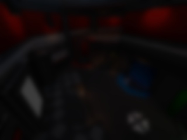
Personally, I would've preferred the option of increasing the scale over the option of decreasing the texture sharpness for this release. I actually love these textures as they are, because of their unique cel-shaded and somewhat cartoonished style along with geometrical variety, the CMYK gimmick and sharpness. I just think that their combination with this layout limits the feel of the space openness to a certain extent. However, I'll be very happy if you use these textures for some of your future releases, since the textures per se are just magnificent!
You're free to do it whatever way you like it as a designer, of course ;) Personally, I think SPIKEDM4, SPIKEDM5, SPIKEDM6 and PLONKER (feat. Ecl1pse, Llanstoloq and @Foo ) have excellent strong gameplay and layouts. I've been enjoying your last maps so far, and they are all suitable for a duel, too.
Another thing I also always appreciate and that I appreciate especially highly is some adventurous (semi-)surrealistic explorative Jailbreak-like maps with some feel of discovering in it :P 😅 And then there are also some cool, and I'd even say unique ideas, some of which @Tig has mentioned in this post, for example: lvlworld.com/thread/27/4
Some of the things that usually matter to me in terms of layout are connectivity, scale, ensuring dynamic gameplay, verticality, enough opportunities for a proper item placement and various spawn poins that would be located far enough from each other and stuff like that :)
Shame that the naming stuff messed it up, but I hope you've got enough brain to work around that lol x
As for the textures, yeah! I get what you mean. I haven't much experience or know-how in making textures aside from hand-drawing them (but I'm shit at anything other than ink+paper), so I kept it very clean sharp and simple (for speed purposes as well).
Glad you two enjoyed this one and if you want then I may have a look at another speedmap in this style. Got any ideas/inspiration for layout? Or shall I just do my "make a cool room with doors here and here and then make another room in there" method that's worked so far?
Edited 10.57 minutes after the original posting.
@Spike Most of your releases are solid 4/5 for me, and this one is not an exception, so it's really cool to see a relatively new mapper making some quality stuff for Q3 in 2023! As for this map, it partly reminds of the aforementioned level, which is one of my favourites. In addition, when it's the case, it's usually a very good sign for me, which is exactly how I see it this time, too :)
Another thing I truly admire is one of the names of the map, which is CMYK. Really, who do all those RGB guys think they are? 😝 On a more serious note, I do see why the level is called so, as the appropriate colours are well distributed on the walls separately.
I appreciate this, since the textures are really eye candy, memorable and rich both in terms of color palette and geometrically. In my opinion, it makes the level look somewhat cartoonish, which is something that I find very interesting. I think, however, that along with Aerowalk's layout, it gives the impression that the level is a bit too small/cramped. To be honest, I find the original QW map a little cramped, too, but that is rather due to its combination with QW's fast movement physics. Maybe it's a good idea to somewhat increase the scale in this new release or to decrease the texture sharpness, so that the CMYK gimmick is kept too. This is because for me these three factors — the not-so-large map size, texture sharpness and color contrast — don't entirely let the feel of being in another world/universe in. I take a running start, but some wall often says to me: "Alright, turn aside now", a little bit faster that I'd like :D
<...>
Fun fact: I darkened the colours for this release. That makes it 3 times
already. 4 if you count the new fade textures lol.
Another further 5ish hours redoing lighting and textures, to make it less of an
eyesore lol
This is a very responsible approach and signs of hard and consequent work. As far as I recall, I saw the level in the map queue before it was updated, and although I don't remember what it was before, I have to say that I liked this version a lot better, so I'm sure the improvement was well worth it.
Overall this is a very decent release. As far as I know, you're the first author on ..::LvL among the three people whose alias is (a variation of) Spike whose real name is geniunely Spike C: Personally, I think this map is best played with 3 match participants. Keep up the good Quake!
I had a great time making this map, and even more fun playtesting it, and I hope you do too :)
Spike
Edited 19 seconds after the original posting.